
Powder Room Wallpaper Ideas: Bold, Durable, Designer-Approved
A powder room is the perfect place to take design risks. It’s small, it’s separated from showers and daily clutter, and it’s often where guests spend a quiet moment noticing the details. If you want a space that feels intentional and elevated, wallpaper is one of the fastest ways to get there.
At Amazing Spaces, we treat wallpaper as the statement piece in a powder room. The goal is not to “add pattern,” it’s to create a complete look that feels curated from floor to ceiling. Here’s how to do it with confidence, from bold patterns to practical material choices, plus a ceiling trick designers love.
1) Treat wallpaper as the feature, then simplify everything else
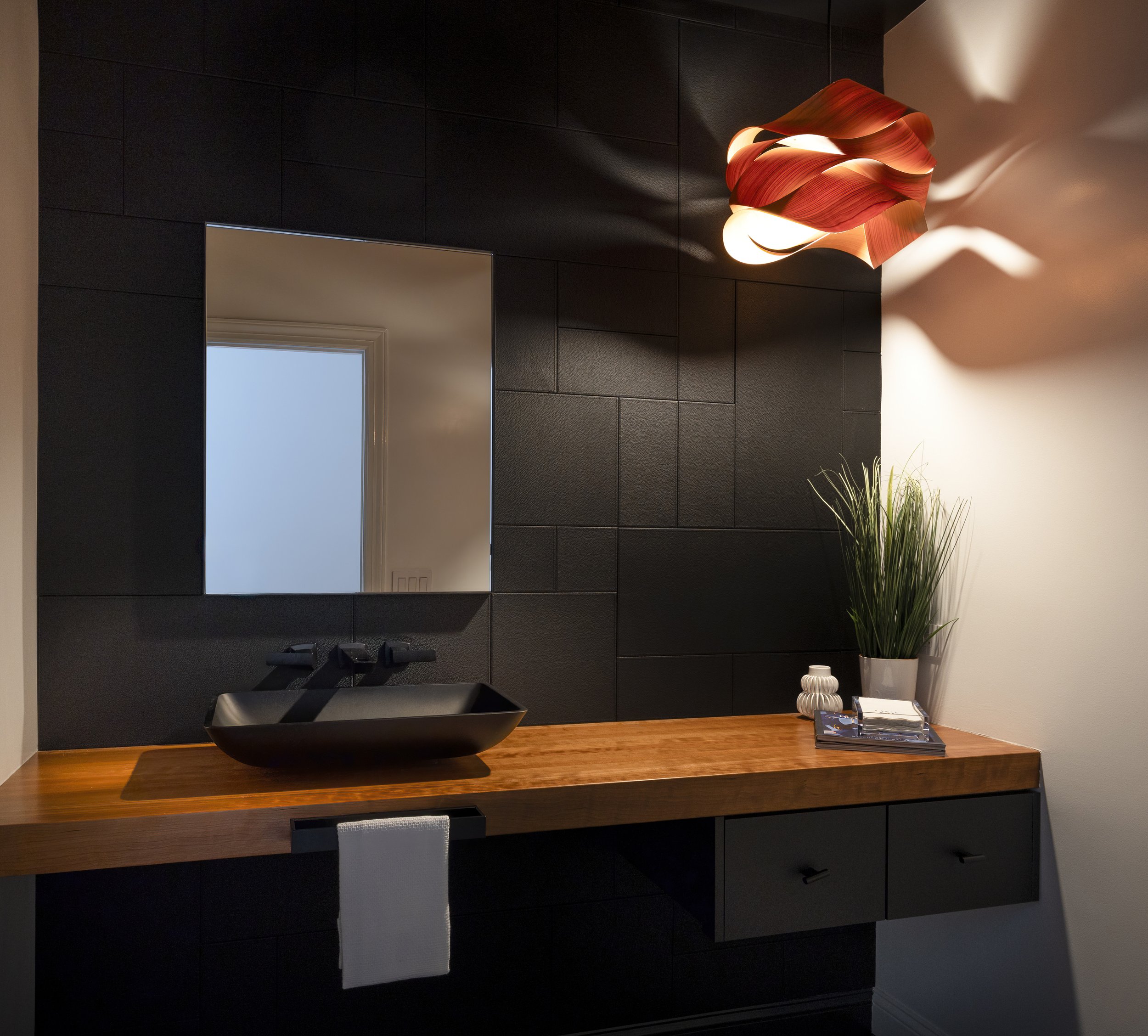
In a powder room, the walls can do the heavy lifting. Bold wallpaper choices often look better in small rooms because the scale feels immersive and purposeful. Think oversized botanicals, graphic geometrics, or richly colored prints that create mood.
Once the wallpaper is the star, keep the supporting cast clean and tailored:
Vanity: Simple silhouette, clean lines, minimal visual clutter
Hardware: Streamlined shapes, one finish, no competing styles
Mirror: Crisp shape (arched, oval, or rectangular) that complements the pattern
Lighting: One strong statement fixture or a refined pair, depending on the mirror
This balance is what makes the room feel designed, not busy.
2) Choose pattern scale for impact (yes, bigger often works better)
Many homeowners play it “safe” with tiny prints in small spaces, but micro patterns can read as fussy from a distance. Large-scale wallpaper is often more flattering in a powder room because it feels intentional and modern.
A quick rule of thumb:
Large pattern: Best for drama, depth, and a high-end look
Medium pattern: A classic choice that’s easier to pair with decorative mirrors and lighting
Small pattern: Works well when the vanity and mirror are ultra minimal and the paper has plenty of negative space
If you’re unsure, pick the pattern you love most, then simplify the finishes around it.
3) Go moody, go saturated, or keep it tonal (all can look timeless)
A powder room is a great place to explore color, especially deeper tones. Saturated hues can make the room feel like a jewel box, while tonal papers can bring texture and softness without overwhelming the space.
Popular designer directions we’re seeing:
Moody and dramatic: Charcoal, forest green, navy, espresso, oxblood
Soft and tonal: Warm neutrals, pale clays, tone-on-tone stripes, linen textures
Fresh and bright: Crisp whites with bold black linework, citrus tones, playful pattern
To keep it cohesive, repeat one color from the wallpaper in a small detail, like hand towels, a soap dispenser, art, or a vase.
4) Pick the right wallpaper material for a bathroom environment
Powder rooms don’t have the constant steam of a full bath, but they do deal with handwashing, humidity, and frequent use. Material matters if you want the paper to look beautiful long-term.
We typically recommend:
High-quality vinyl or vinyl-coated wallpaper for durability and easier wipe-downs
Moisture-resistant adhesives and professional installation, especially around sinks
Strategic placement if you love a delicate paper: keep it away from direct splash zones, or add a protective backsplash
If you’re investing in a powder room renovation, treat the wallpaper as a finish material, not a temporary accessory.
5) The ceiling is a design opportunity (and it does not have to be white)
Here’s the designer move that instantly makes a powder room feel custom: treat the ceiling as part of the design plan.
Options we love:
Paint it a deep color pulled from the wallpaper for a wrapped, cocooned feel
Wallpaper the ceiling to extend the pattern and create a boutique-hotel vibe
High-gloss ceiling paint for a subtle reflective finish that feels polished
Metallic or pearlescent paint to add glow and dimension, especially with warm lighting
If you want the room to feel taller, you can even carry wallpaper slightly above the crown line, then paint the ceiling in a coordinating tone. There truly are no rules that say it has to be white.
6) Pair wallpaper with the right surfaces: vanity, countertop, and trim
Wallpaper looks most expensive when it has the right contrast.
A few pairings that work beautifully:
Bold wallpaper + light stone countertop: Keeps things bright and balanced
Moody wallpaper + warm wood vanity: Adds richness and a welcoming feel
Tonal wallpaper + statement mirror: Lets shape and lighting shine
Graphic wallpaper + simple trim: Prevents competing lines and visual noise
Trim tip: If your powder room has wainscoting or panel molding, keep it crisp and clean so the wallpaper reads as intentional, not crowded.
7) Lighting and mirrors: the difference between “nice” and “wow”
Wallpaper is visual texture, and it loves good lighting. The right fixture can sharpen a pattern, highlight metallic details, and make color feel richer.
Our quick guidelines:
Choose warm, flattering light (especially in moody rooms)
Use a mirror that matches the wallpaper’s “personality” (curved for organic patterns, clean lines for modern graphics)
Keep finishes consistent (for example, polished nickel everywhere, not three different metals)
A well-lit powder room with beautiful wallpaper feels like a destination.
Common powder room wallpaper mistakes to avoid
Too many competing focal points: Let wallpaper lead, then edit the rest
Ignoring scale: Tiny prints can look busy; oversized patterns often look more refined
Skipping moisture considerations: Choose durable materials and install properly
Forgetting the ceiling: It’s a prime place to add drama or cohesion
Mixing too many metals and styles: Consistency reads luxury
A simple checklist for a designer-level result
Before you commit, ask yourself:
Does the wallpaper feel like the “hero” of the room?
Are the vanity, mirror, and hardware simple enough to support it?
Did I choose a durable wallpaper material suitable for bathroom use?
Can I pull one color from the wallpaper into accessories for cohesion?
Did I consider a ceiling finish that complements the walls?
If you can answer yes to most of these, you’re on track.
Ready to elevate your powder room?
Wallpaper can transform the smallest space in your home into one of the most memorable. If you want a powder room that feels high-end and effortless, we can help you select finishes, refine the layout, and build a cohesive design from wallpaper to lighting to ceiling.
Amazing Spaces designs and renovates bathrooms and powder rooms throughout Greenwich and across Fairfield County, with many clients also in Westchester County. Explore our bathroom design portfolio, then reach out when you’re ready to create a space that feels truly custom.